I’m very happy with iOS 12. It’s one of Apple’s best iOS releases in years. Part of the reason it worked out so well is that Apple didn’t bite off more than it could chew—nearly all of iOS 12’s features were available at launch, or came very quickly in an update. It’s a huge improvement over iOS 11’s problematic rollout. iOS 12 seems primarily geared at smoothing out long-standing pain points: we got a renewed focus on performance and reliability, grouped notifications, Screen Time, Group FaceTime, and better Maps.
But Apple can do more, much more. The latest iPhones and iPad Pros sport processors, cameras, and sensors that are capable of incredible things, but iOS at times feels like its holding us back. In particular, the iPad Pro feels like it has everything it needs to be a complete laptop replacement—except an operating system that lets you do everything you need to do on a laptop.
With that in mind, here are some of the things I hope to see in iOS 13.
Keep it fast, but drop support for the oldest devices
Apple’s focus on performance in iOS 12 made a huge difference to older iPhones and iPads. You won’t necessarily see it in benchmark app results, but in practice the difference is night and day. The keyboard and share menu springs right open where there used to be a short delay. Apps launch faster. Scrolling is smoother with fewer dropped frames. It’s not uncommon to hear iPhone 6s or iPad Air 2 owners say, “It’s like my phone is brand new again!”
Whatever changes Apple makes in iOS 13, it’s imperative that it keep performance every bit as fast and responsive as iOS 12.
I could understand if iOS 13 doesn’t support all the same devices as iOS 12, however. I might even welcome it. It’s impressive that you can run iOS 12 on everything going back to the iPhone 5s and iPad mini 2, but those devices have only 1GB of RAM. Cutting off the oldest devices would still allow Apple to support iPhones and iPads up to five years old, but lets it build iOS 13 with a minimum RAM requirement of 2GB. The features Apple can add with a higher minimum RAM spec are probably well worth the tradeoff.
Dark Mode
You know what Apple operating system has a dark mode? macOS Mojave. And now that a greater number of apps have added Dark Mode support, it’s pretty great.
Adding Dark Mode to iOS just makes sense, and not just because users have been clamoring for it for years. Apple is deep into a project to make it easy to port iOS apps to the Mac by adding support for UIKit—the iOS interface development framework— to macOS Mojave. At the start, Apple alone is using these tools to port a few iOS apps to macOS Mojave: News, Home, Voice Memos, and Stocks. Eventually, the tools will allow all developers to much more easily create macOS versions of their iOS apps.
But if you’re using UIKit to develop a Mac app, and UIKit doesn’t have support for Dark Mode, then how are you going to support Dark Mode on Mojave? Now that Apple is bridging the gap between iOS and Mac app development, it makes sense to provide Dark Mode tools in the UIKit framework for use on both platforms.
A smarter Siri
Apple took an interesting approach to improving Siri in iOS 12: it make tools for others to make Siri more useful. Developer tools allow Siri to provide proactive suggestions on the lock screen for in-app actions, and for users to assign their own custom Siri voice prompts to access an app’s features.
Power users can take it a step further with the Shortcuts app, which is like Automator for iOS. It lets you create custom Siri phrases to perform an entire string of actions from a variety of apps and operating system functions. Neat!
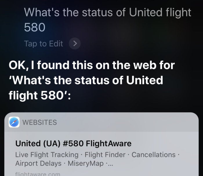
None of this actually makes Siri smarter. Siri still lags way behind Google Assistant and Alexa in its ability to answer general questions and gracefully perform actions with third-party hardware and services. There are so many obvious shortfalls; you can do a Spotlight search for a flight number and get detailed flight info, but ask Siri and you just get a web search.
Siri needs better voice recognition, faster response times, and more “fun” activities like trivia and games. It needs to give more accurate answers to a much broader set of questions. Most of all, SiriKit needs a major expansion into new Domains like music and shopping
How is this volume popup still a thing?
Adjust your iPhone or iPad volume, and a big fat overlay takes up the whole middle of the screen. It’s an overwhelming interface convention for a feature that many people use multiple times a day.
Apple is obsessed, maybe more than any other technology company, with the fine details of its interface. But this big ugly pop-up assaults us every time we invoke a basic, common function.
A smarter and more flexible camera
Apple continues to make great strides in computational photography, but I think it can do a lot more even without introducing new hardware. There’s no reason the iPhone XR’s portrait mode should be limited to human faces, for example, when Google’s done single-lens portrait mode on any subject for a couple years now. Increasing overall image quality and especially the quality Portrait mode and Portrait lighting should be a high priority, and not one reserved for products with the inevitable A13 processor and it’s undoubtedly more powerful Neural Engine.
More than that, it may be time to rethink the entire Apple camera interface. It’s simple and intuitive, but it feels as though Apple has had the same Camera app for years and just keeps adding stuff onto it.
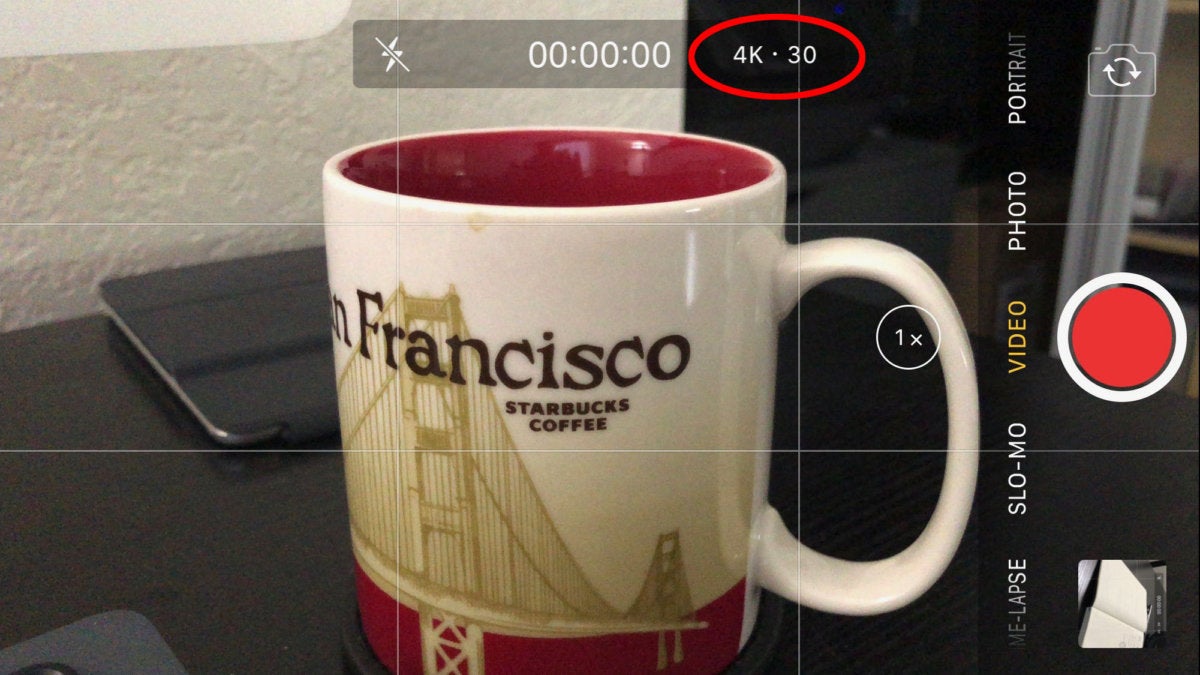
In particular, it would be great to see more options for enthusiasts to control settings from within the app, even if only in a “Pro” tab. Let us control frame rate and resolution of video recording without jumping into the Settings app. Give us control over white balance, ISO, and shutter speed. These sorts of manual features aren’t for everyone, but they will help drive home the message that the iPhone isn’t just as good as a real camera, it is a real camera.
A new home screen
There hasn’t been a significant update to the iOS home screen since iOS 7, more or less. Now that iPhones are different—bigger, with a taller and narrower aspect ratio, and a Notch, and no Home button—maybe it’s time to re-think the entire home screen.
I don’t expect grids of icons to go anywhere. It’s so well-understood and intuitive that there may be little benefit to completely changing the paradigm.
But the icons could look different. Perhaps they could even be dynamic—if not animated, then able to display different icons to match different states of the app. Or at least, one icon for Light Mode and one for Dark Mode (because we will finally get Dark Mode, right?).
Maybe it’s time to bring Siri smarts to the home screen instead of just Spotlight search. Is it time for the home row to be (optionally) dynamic, based on the apps you typically use at given times, days, and locations? Maybe a small strip below the notch could be reserved for Siri to proactively tell you things that might be helpful, like alerting you to slow traffic on the way home or that it’s expected to start raining in two hours.
Apple shouldn’t just copy Android with an app drawer and search bar, but it’s certainly time to let us put app icons and folders wherever we want, instead of forcing them to fill in space from the top-left. And perhaps the world is ready for an iOS home screen that is more than a dumb collection of icons, but instead tries to give you helpful, glanceable information.
Take the restraints off the iPad
I’d love to see the iPad become the full computer replacement Apple keeps marketing it as, but iOS is simply too restrictive to make that a reality. The Files app needs to be able to show the contents of external storage. You should be able to run two instances of the same app side-by-side. Multiple accounts would make shared family iPads a lot easier to manage. Safari on the iPad should have more in common with desktop Safari, and should default to showing full desktop sites instead of mobile sites.
Support YouTube 4K and HDR video
It’s sort of ridiculous that the super high-res displays of the iPhone XS Max and iPads can still only display YouTube videos at a maximum of 1920x1080. Higher resolutions, and HDR video, exclusively use Google’s royalty-free VP9 codec.
Apple steadfastly refuses to support the VP9 codec, or to allow apps to implement their own video codecs. And even third-party browsers all have to use Safari’s rendering engine. So whether in browser or the YouTube app, every iOS device maxes out at 1080p and SDR.
I know Apple, Google, and many others are hard at work on the royalty-free AV1 codec to supersede both HEVC and VP9, but it’s going to be awhile until that’s commonplace. In the meantime, iPhone and iPad users are missing out on what is almost certainly the largest repository of 4K video content on the internet. Swallow your pride, Apple, and support VP9 (or at least, let Google do so in their YouTube app).
Always-on display
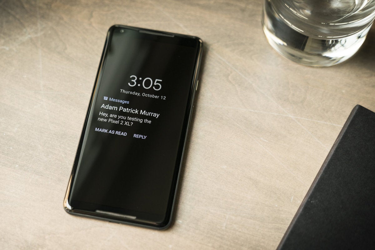
Now that Apple has three iPhones with OLED displays, it makes sense to give them an always-on display. OLEDs only use energy for the pixels that are lit up, so lighting up a small percentage of the screen only uses a sliver of battery.
Eventually, we would love to see a customizable, developer-accessible always-on display for OLED-enabled iPhones (iPhone X and its successors). It could include various clock designs to choose from and a selection of widgets made with a new API for app developers. Those may be similar to the left-of-home-screen widgets in iOS today, but simplified for the reduced color and black background emphasis necessary to preserve battery life.
That may be too much to hope for. For iOS 13, we would be happy with a “phase one” always-on display: Just show us the clock, any upcoming calendar appointments or reminders, the weather, and maybe a simplified representation of the most recent notifications. The big API for developers and customization stuff can come in phase two the following year.
Notifications syncing
If you have an iPhone, iPad, and a Mac, you’ll find you often get notified about the same thing on all of them. With Apple’s plan to make it easy to port iOS apps to Mac, that’s only bound to get worse.
Apple should allow notification status to sync through iCloud. If I dismiss a notification on my iPhone, that same notification should be gone the next time I pick up my iPad.
There are other features Apple could implement to help deal with multiple-device notification overload. For example: how about a setting so that if you’re actively using one device (your iPhone, for example), new notifications that are delivered to all your devices will only make noise or vibrate your iPhone. Your iPad and Mac will stay silent. Once you’ve stopped using any one device for awhile (let’s say 5 minutes), they’ll go back to making sound/vibrations on all your devices in accordance with your settings.


0 comments: